2. Adding a Simple GUI
Now let's move to Interface Builder and construct a simple GUI. Double-click DudelViewController.xib to open it in Interface Builder.
First, let's make sure that the nib file uses our DudelView class instead of just a plain-old UIView. Select the UIView object and open the identity inspector ( 4). At the top of the panel, click the Class combo box and change the selection from UIView to DudelView.
While we're still looking at it, let's create the connections between
this view and the controller. Start by control-dragging from the Dudel
View icon to the File's Owner icon, which represents the DudelViewController that loads this nib. Release the mouse button, and in the context menu that appears, pick delegate. Now control-drag from the File's Owner icon back to DudelView, and select dudelView from the resulting context menu.
4). At the top of the panel, click the Class combo box and change the selection from UIView to DudelView.
While we're still looking at it, let's create the connections between
this view and the controller. Start by control-dragging from the Dudel
View icon to the File's Owner icon, which represents the DudelViewController that loads this nib. Release the mouse button, and in the context menu that appears, pick delegate. Now control-drag from the File's Owner icon back to DudelView, and select dudelView from the resulting context menu.
With that out of the way, we
can focus on those all-important buttons at the bottom of the screen.
Start by making sure you can see the DudelView layout window. If not,
double-click the Dudel View icon in the main .nib
window so that the layout window appears. If your screen isn't large
enough to display the entire window, scroll down so that you can see
the bottom. Now find UIToolbar in the
Library, and drag one out to the DudelView layout window, placing it at
the bottom of the window. Open the attribute inspector (1) and change the toolbar's style to Black Translucent.
The toolbar you just created includes a single UIBarButtonItem,
which we'll use as a starting point for all our toolbar buttons. Use
the attribute inspector to set the button item's Style to Plain (since
the images we're using have a border of their own), and then press D
to duplicate the item. And duplicate it again and again and again. We
want to have five of these items, and we want them all to be Plain, so
this is quicker than dragging a button item out from the Library five
times and setting the style each time.
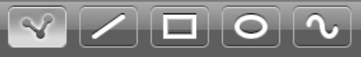
These button items need to be
assigned some imagery. Click the left-hand button and use the attribute
inspector to set its Image to button_cdots_selected.png.
This first button is going to be selected by default, so we'll start it
off with the selected image. Now go through the remaining buttons and
set their images to button_line.png, button_rectangle.png, button_ellipse.png, and button_bezier.png. These are the normal (unselected) versions of the images. You should now see something like Figure 2.
Now all that's left is
to connect each of those buttons to an action method in the controller,
and connect an outlet from the controller back to each button. Start
with the button item on the left. Control-drag from it to the File's
Owner icon, and select the touchPencilItem: action. Then control-drag from the File's Owner icon back to that button item, and select the pencilButton
outlet. Go to the next button (the one with the straight line icon),
control-drag from it to the File's Owner icon and select the touchLineItem: action, and then control-drag from File's Owner back to that button item and select the lineButton
outlet. Do the same for the three remaining button items, so that each
is set to trigger the appropriate action method in the controller, and
each of the controller's outlets is connected to the correct button
item.
With all this in place, you
should now be able to build and run your app in the iPhone Simulator.
If you get a big, blank canvas with a row of buttons at the bottom that
don't do anything when you touch them, then you've achieved the goal
for this portion of our project. Congratulations!